The English Seaside: Postcards from The Edge
Travels at Home: Postcards From The Edge – For some time now I’ve wanted to find an image that would illustrate at a glance the notion of travelling at home, in my case the faded old seaside town of St Leonards-on-Sea and its immediate environs. But it wasn’t until a few days ago when I paid a visit to Seaside Modern: Art and Life on The Beach, an exhibition at the Hastings Contemporary art gallery, that I felt inspired to start looking around in earnest.
The exhibition, which celebrates the allure of the English seaside from Victorian times through the post-war era of the Fifties and Sixties, occupies two floors of the gallery and contains a colourful mix of vintage railway posters, advertisements, postcards, photographs, etchings and paintings of seaside holiday destinations from Yorkshire to Cornwall and of course the south coast.
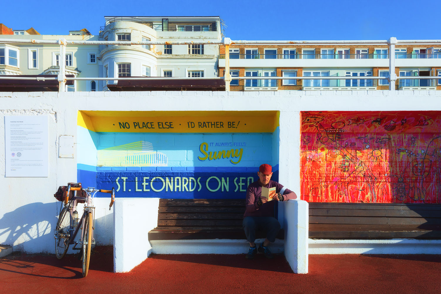
In looking around for a suitable setting I found this mural, one of a series of brightly coloured murals painted along this stretch of the 1930s Modernist promenade in St Leonards. With its art deco lettering and cheery slogan promoting sea and sun, and its depiction of the sleek façade of the Streamline Moderne Marine Court building which dominates the St Leonards seafront, it called to mind the old travel posters from back in the golden age of the English seaside holiday, when travelling to the seaside meant you were leaving your cares behind – and going somewhere fun and exotic!
To do this shot properly meant coming down to the seafront at the unaccustomed hour of eight o’clock in the morning, much, much later than usual. Buoyant old-style railway travel posters, I learned after a couple of unsatisfying early morning takes, aren’t about subtle lighting and muted tones. They’re about bold colours, dazzling sunshine, deep angular shadows and of course a taut blue sky. I was fortunate that all this came together yesterday morning. As a side note, the map I am holding is an original Bacon’s cycling map of Hastings and its environs, dating from around 1907 – making it somewhat anachronistic for the overall 1930s tone I was after, but I liked its ornate design, the name of the town in dashing bold script and the image of the cyclist on the cover.